
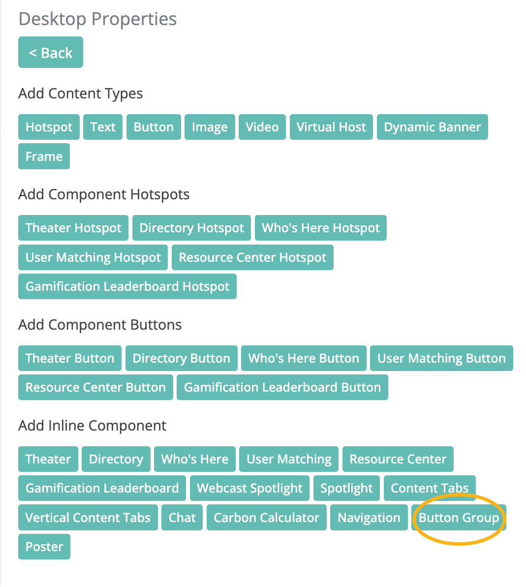
The Button Group component is a versatile tool in the Chati space editor that provides maximum flexibility when building engaging event experiences. This component truly shines when creating responsive spaces and transforming traditional 3D desktop layouts into modern, application-style content optimized for mobile and tablet devices.
What Makes the Button Group Special
Without creating numerous new assets manually, you can accomplish seamless information transfer and improve event content accessibility through the Button Group component. This component allows you to:
- Replace physical 3D objects (like signage stands) with clean, interactive buttons on responsive devices
- Create organized navigation menus for event features and content
- Build resource centers with categorized, scrollable content
- Link to multiple event destinations, features, and actions in an organized way
How to Add a Button Group to Your Event Space
Adding the Component
- Select a space, and open the space editor
- Select the device view (Desktop or Responsive) where you want to add the button group
- Click Add Content
- Click and drag the Button Group component into your space
- Position the component where you want it to appear
Configuring Button Group Properties
When you click the Edit button on your Button Group component, you'll see several configuration options:
Button Style Options:
- Card: Square box format with centered icon above text
- Compact: Rectangular button with optional icon to the left of text

Layout Style Options:
- Grid - No Scroll: Displays buttons in a grid format without scrolling
- Grid - Vertical Scroll: Grid format with vertical scrolling capability
- List - No Scroll: Single row or column without scrolling
- List - Horizontal Scroll: Single row with horizontal scrolling
- List - Vertical Scroll: Single column with vertical scrolling
Important Note: Vertical scroll layouts require a fixed height, which you set in the position style settings. For all other layout types, we suggest using "auto" for your height setting.
Creating and Configuring Buttons
Adding Individual Buttons
- Click Edit on your Button Group component
- Click Add Button
- Configure each button with the following options:
Button Label:
- Keep labels to 25 characters or less for optimal display
Button Icon:
- Select from the platform's icon library, or
- Upload custom icons (recommended size: 48 pixels x 48 pixels)
- Choose “None” for no icon
Icon Customization:
- Icon Color: Defaults to your primary brand color, but can be customized (Custom uploaded icons will not change color when you adjust icon color settings)
- Icon Background Color: Defaults to light gray, but can be changed

Click Action Types
Button Groups support multiple action types to link users to various destinations:
Links:
- External URLs
- Event spaces
- Webcasts
- Surveys
- Default space
- Next booth
- Parent booth
- Previous booth
- Schedule a meeting
- Private messages
- User profile
- Networking hub
- My journeys
- Log out
- Environmental impact
- Data portal
- Business cards
- Briefcase
- Announcements
- Agenda builder
Components:
- Booth features
- Handouts
- Leaderboard (select one or multiple games)
- Who's Here
- Theater (select one or all event tracks)
- User matching
Target Selection: When linking to event spaces or external content, remember to select the appropriate target:
- Same Window: Use for navigating to other event spaces
- New Window/Tab: Use for external links when you want users to stay in the event
- Slide Out: Useful for My journeys, Business Cards, Annoucements, or Private Chat
- Modal: To open the content to a modal
Advanced Button Group Configurations
Component-Specific Settings
When using certain click actions, additional configuration options are available:
Theater Component:
- Adjust modal title
- Set default view
- Configure webcast tabs
- Identify specific tracks
Leaderboard:
- Select specific games to display
- Adjust modal title
Who's Here:
- Set default view and page entry count
- Adjust modal title
User Matching:
- Adjust modal title
Note: Component defaults are set to use all games, all tracks, etc., unless you specify items to display.
Layout Considerations
Card Style Best Practices:
- Use for visual emphasis and when you want larger, more prominent buttons
- Ideal for main navigation or featured actions
- Works well with Grid layouts
Compact Style Best Practices:
- Use when space is limited or you have many options
- Perfect for List layouts
- Efficient for displaying multiple actions without taking up too much screen real estate
Using Button Groups for Responsive Design
Transforming Desktop to Mobile Experience
One of the Button Group component's most powerful applications is creating responsive experiences that differ from your desktop layout.
Example Scenario: Your desktop lobby has 3D signage stands for "Carbon Calculator" and "Trending News." These physical-looking elements wouldn't translate well to mobile devices.
Solution:
- Add a Button Group to your responsive view
- Create buttons linking to the same content the 3D signs reference
- Add additional helpful buttons for other event features
- Organize them in a mobile-friendly list or grid
This approach maintains content accessibility while providing a native app-like experience on mobile and tablet devices.

Using Button Groups in Desktop Environments
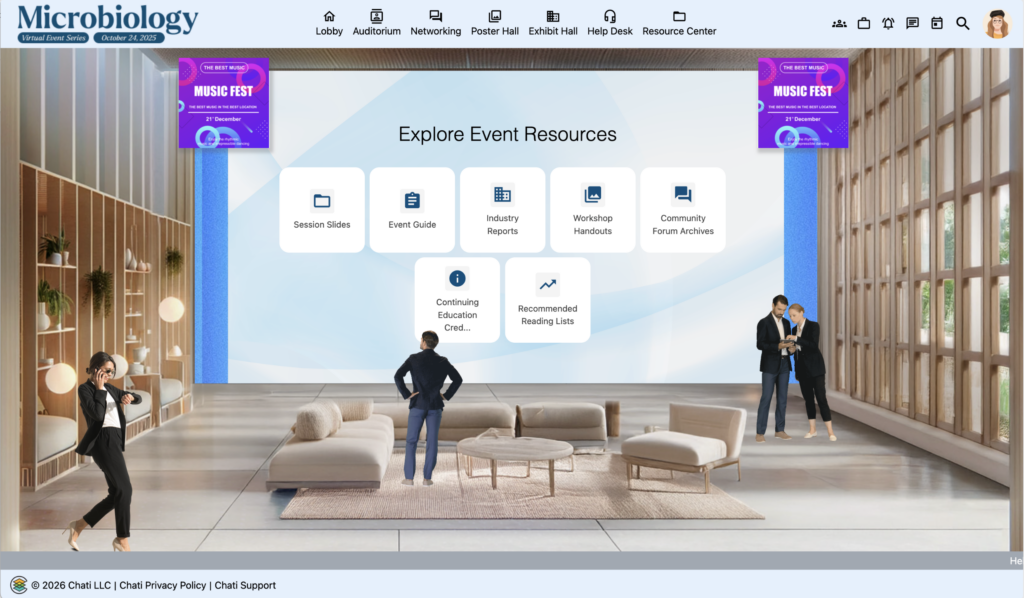
Resource Centers and Content Libraries
Button Groups aren't just for responsive design—they're excellent for desktop experiences too, particularly for Resource Centers.
Advantages Over Static Graphics:
- Adaptability: Buttons adjust to content changes without requiring new graphics
- Scrollability: Vertical scroll allows unlimited categories without cluttering the space
- Easy Updates: Add or remove categories without design work
- Interactive Feedback: Buttons provide hover states and click feedback
Copying Button Groups Between Desktop and Responsive
Streamlining Your Workflow
Save time by copying configured Button Groups between desktop and responsive views instead of recreating them from scratch.
Steps to Copy:
- Build your Button Group in one view (Desktop or Responsive)
- Configure all buttons, links, and styling
- Save the component
- Navigate to the other view (Responsive or Desktop)
- Add a new Button Group component
- Return to your original configured Button Group, click Edit
- Click the Copy to Responsive (or Copy to Desktop) button in the bottom bar
- Save your work
- Navigate back to the destination view
- Click Edit on the new Button Group to verify all buttons copied successfully
Important Notes:
- The copy function creates a one-time copy—it doesn't link the two components
- Future changes to one Button Group will NOT automatically update the other
- If you make changes to the original, use the copy button again to update the destination